[Before] Polsky Tech Publisher Home Page
Overview
The University of Chicago Polsky Center for Entrepreneurship and Innovation is a professional development hub that supports entrepreneurial projects and endeavors by providing educational training and partnering with investors, project partners, and project creators. The Polsky Center website plays a major role in outreach and communication of these technologies with industry professionals.
The Polsky Center website displays an area for researchers and project starters to disclose their ideas by filling out an invention disclosure form. From there, the Polsky Center’s goal is to form a partnership with collaborators, fund their research and product invention, and eventually have companies license patents to their intellectual property all through the process of technology transfer.
CHALLENGE
Our design team was tasked with redesigning the Polsky Center Technology Publisher website. The three web pages to be redesigned were the technology publisher home page, search page, and technology page. This redesign is critical in helping industry partners understand how to access the Polsky Center's resources and explore technologies the Polsky Center has helped fund and develop.
The main issues faced by the Polsky Center for their website redesign were determining how to facilitate website navigation and how to improve the discoverability of key elements within the site. Implementing UX principles was necessary in making this process as streamlined as possible to increase site traffic, understanding, and usability for staff and industry partners.
Role
Role: UX/UI Researcher and Designer
Timeline: September 2020 - April 2021
Platform: Hi-fi wireframes
Team: Natalie Lampa, AJ Carter,
Akin Coffy, Ciara McCormack
Timeline: September 2020 - April 2021
Platform: Hi-fi wireframes
Team: Natalie Lampa, AJ Carter,
Akin Coffy, Ciara McCormack
Approach
Competitive Analysis Personas & User Flow
Heuristic Evaluation Lo-fi & hi-fi wireframing
Usability Testing Prototyping
Results
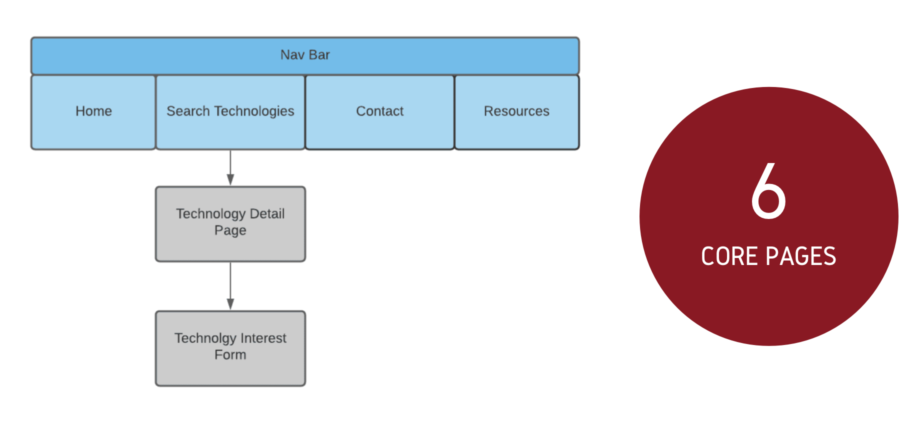
Our team created a hi-fi prototype of the website in AdobeXD with 6 core pages. The redesign saw an increased System Usability Score, moving the website from rank B (good) to rank A (excellent), providing evidence that the new website was preferred by the target users for being easier to navigate and for improved discoverability of key elements.
The AdobeXD interactive prototype has been handed off to the web development team for implementation.
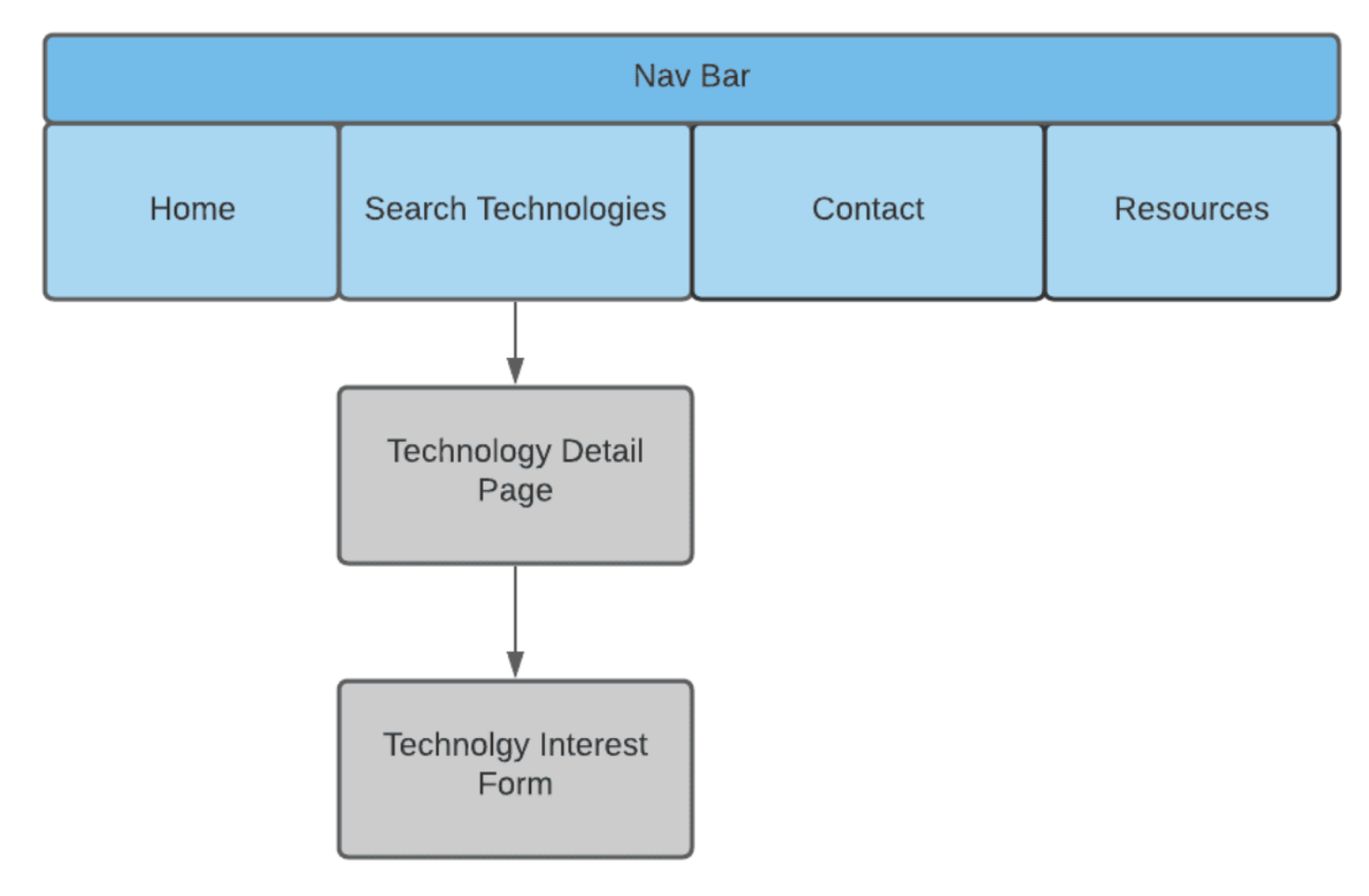
Redesigned Site Map
Design process
COMPETITIVE ANALYSIS
To inform our initial design decisions, we began our research phase with a competitive analysis. We compared the Polsky Center's current website to other technology publisher websites across various usability criteria and components within a competitive analysis matrix.
Our direct and indirect competitors included Skysong Innovations, Oxford University Innovations, and Tech Transfer at the University of Michigan. This initial step resulted in several key findings that were valuable throughout the project.
MAIN takeaways
• Grid layouts are an effective way to balance
content
• Offering several browsing views allows
flexibility to users
• Concise summaries makes parsing
information faster
• Most tech publisher websites direct the user
immediately to search
Heuristic Evaluation
Next, we conducted a heuristic evaluation, in which we each evaluated the current Polsky site based on Nielsen's usability heuristics. This allowed us to identify potential pain points for users and note areas for improvement.
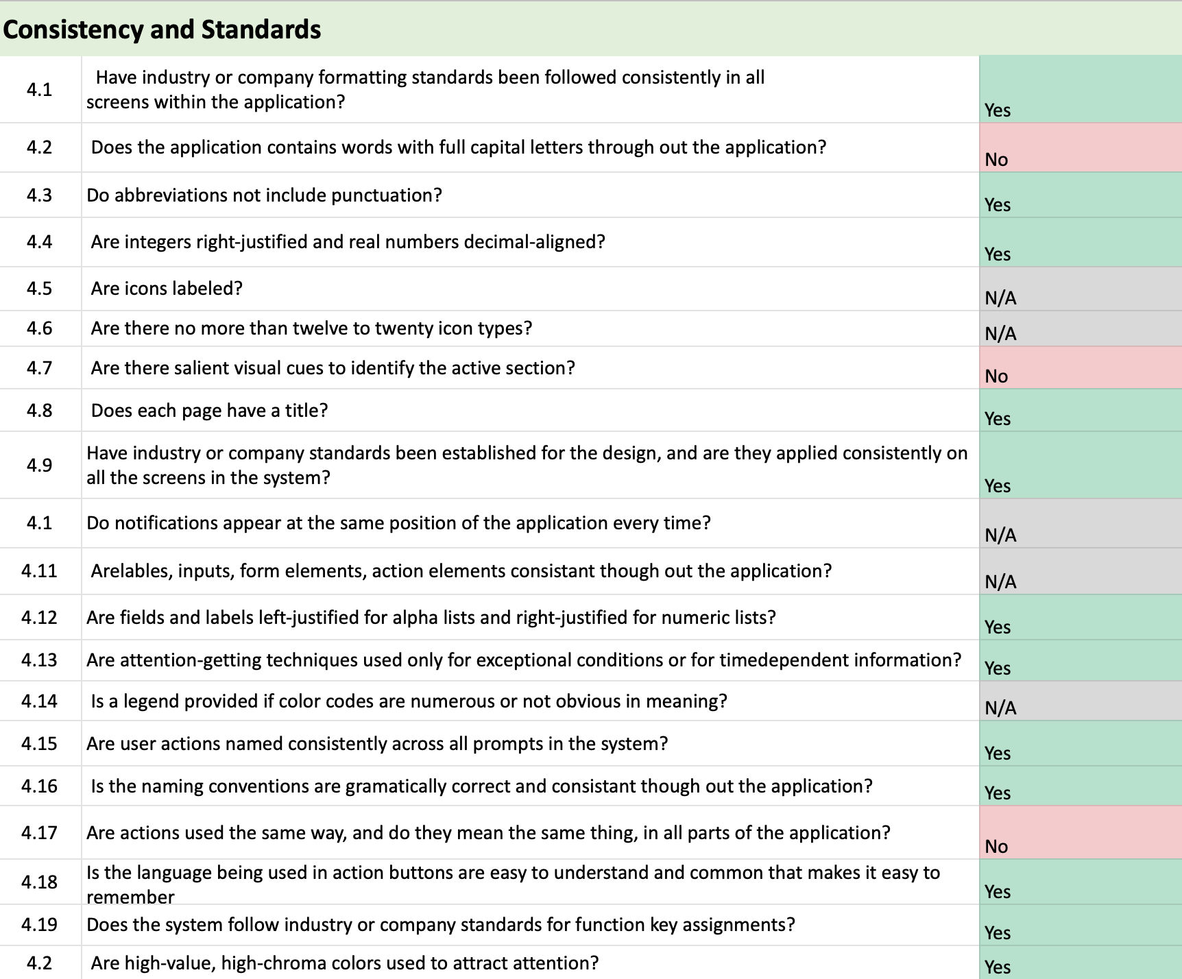
Through an analysis of the site’s consistency and standards, I noted three main issues. Firstly, the search button does not effectively capture a user’s attention due to its position. I recommend the color and style of the button be redesigned and re-positioned at the top of the page to better communicate to the user that it is a search button.
Next, the “Available Technology” button above the filters box appears even when on the page itself, and this seems redundant. It is also unclear that this is a button.
Further, there are inconsistencies with the appearance of tags, filters, and the search button which may confuse users as they attempt to navigate the page. I recommend developing a more uniform design, which may include adding icons to the page for simplicity and consistency with industry standards.
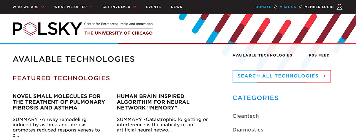
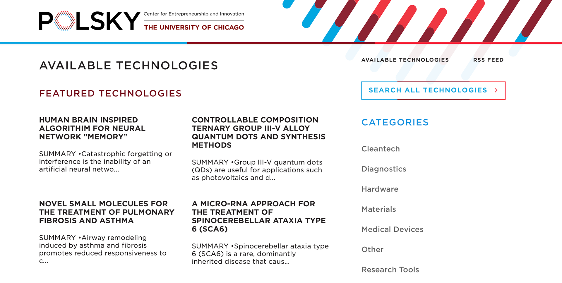
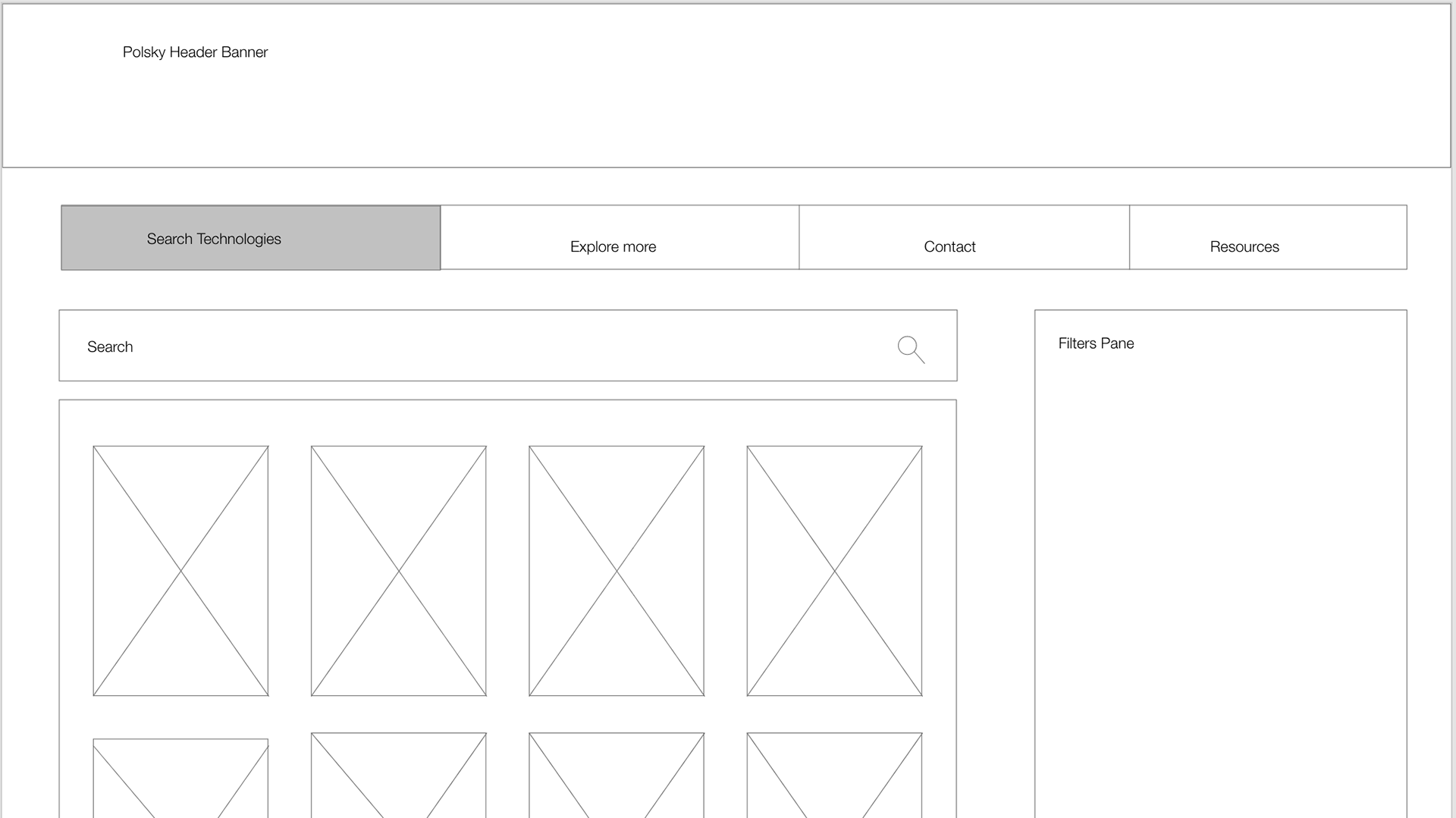
[Before] Tech Publisher Home Page with Search Button
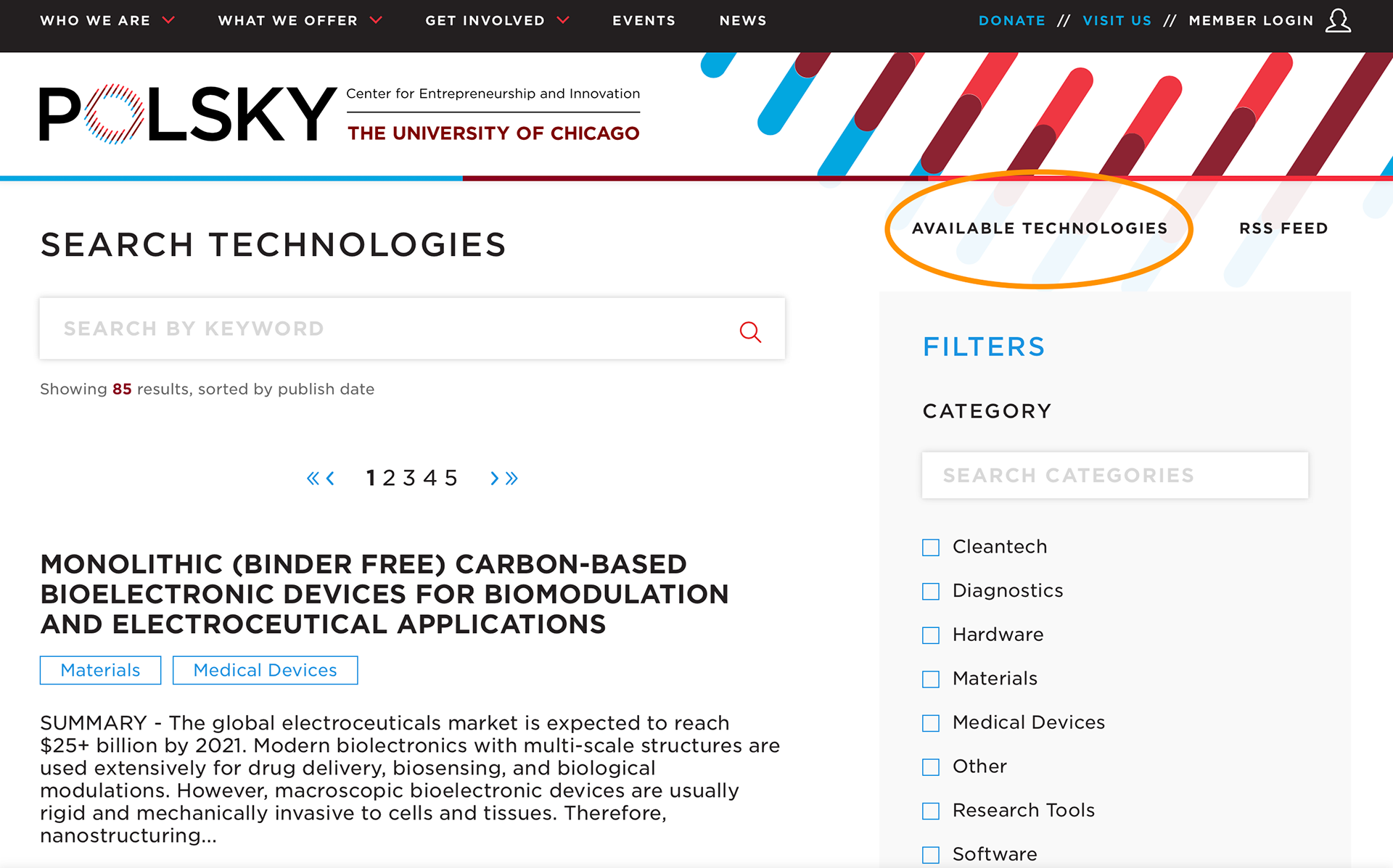
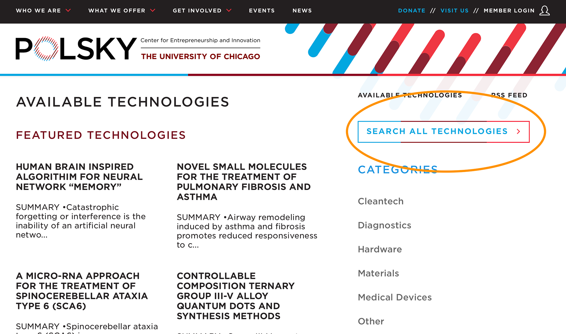
[Before] Tech Publisher Search Page with "Available Technology" Button
main takeaways
• Confusion between home and search pages
• Button styling inconsistent and unclear across pages
• Multiple filter selections do not overlap within search results
USABILITY TESTING & USER INTERVIEWS
Lastly, we conducted combined usability testing sessions and user interviews on the current Polsky website. This allowed us to connect directly with our target users to gather their overall impressions of the site, including areas of frustration, potential areas for improvement, and develop priorities for improving their experience.
During this phase, I was responsible for user recruitment, scheduling and correspondence, and moderating user interviews/usability tests over Zoom.
main takeaways
• Users have difficulty parsing content (text heavy)
• Users felt the Home page lacked relevant information
• Users don't typically "browse" tech publishers
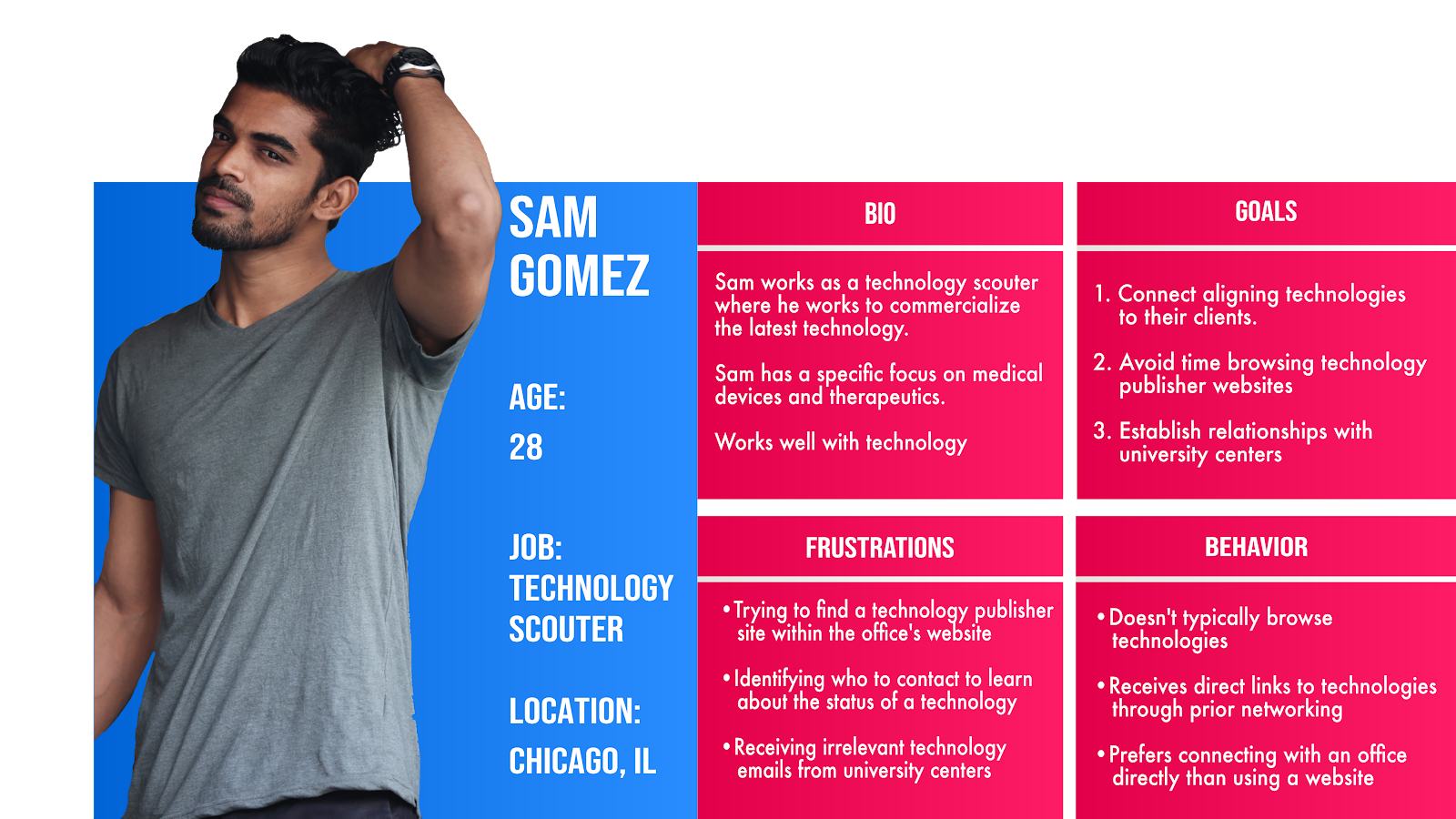
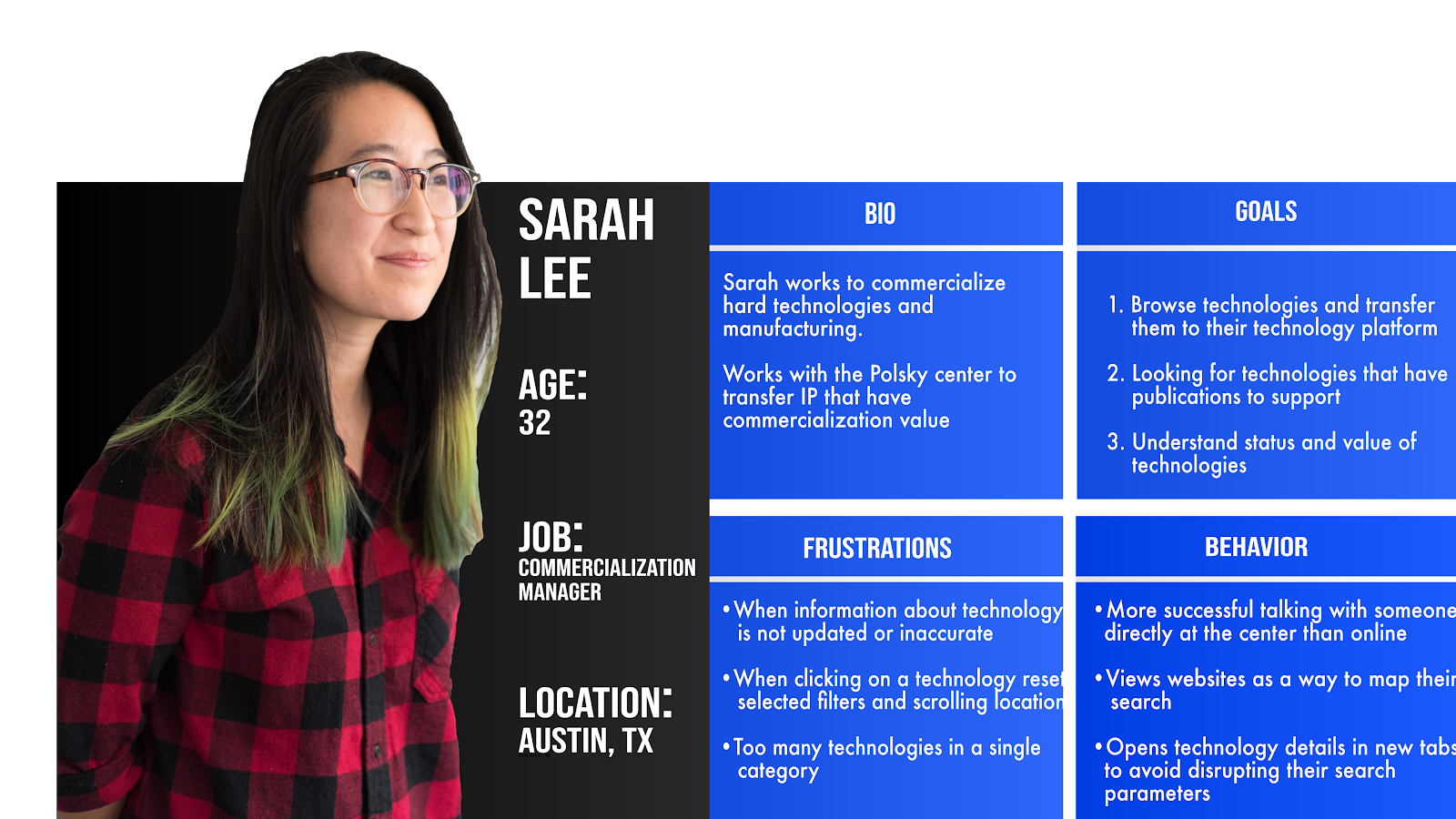
PERSONAS
Our initial research outlined above contributed to our development of user personas.
wire-framing and prototyping
Utilizing the personas, we began our iterative design process from low-fidelity to high-fidelity designs.
[Before] Home Page
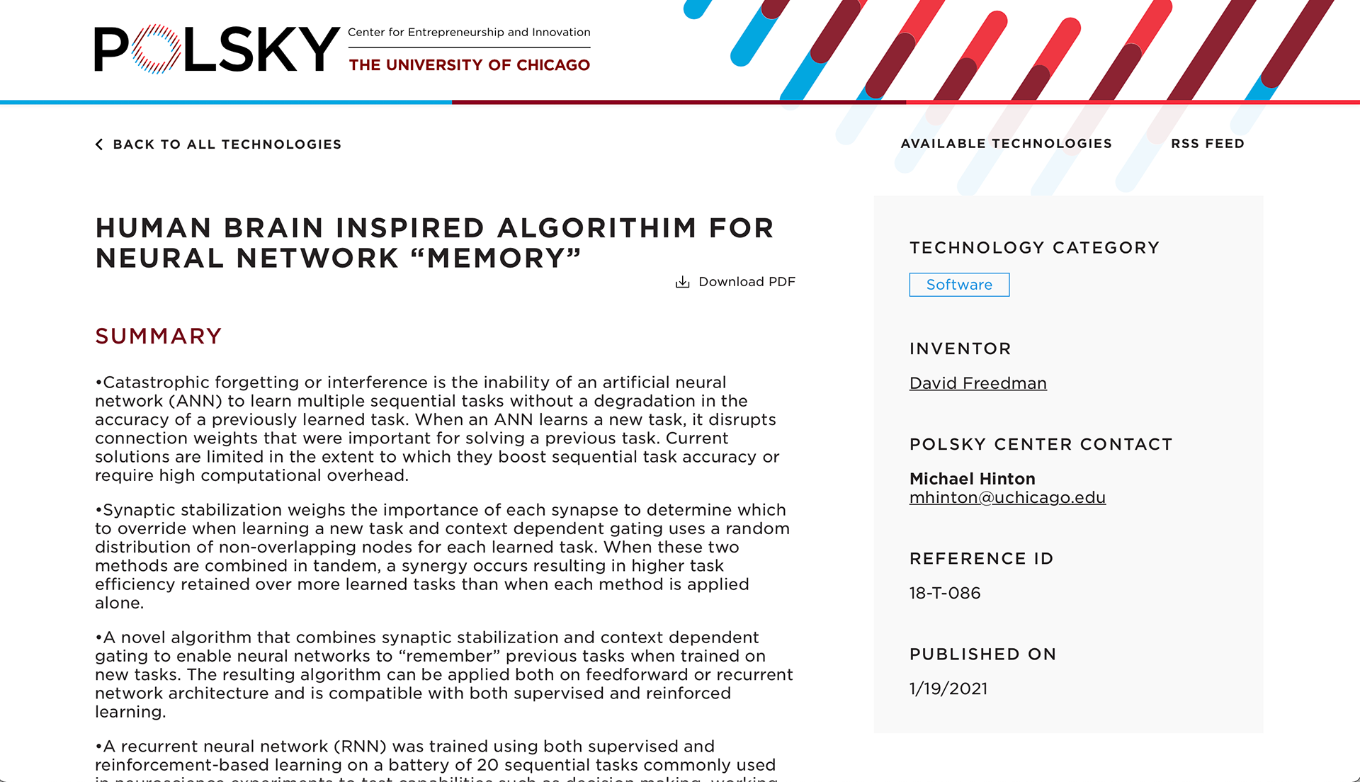
[Before] Tech Detail Page
Lo-fi Wireframe
Medium-fidelity Home Page
As for the Technology Detail page, which had an excessive amount of white space between content, I recommended a tab structure to minimize scrolling. The most important information, including the tech summary can now be found in closer proximity.
Medium-fidelity Technology Detail Page
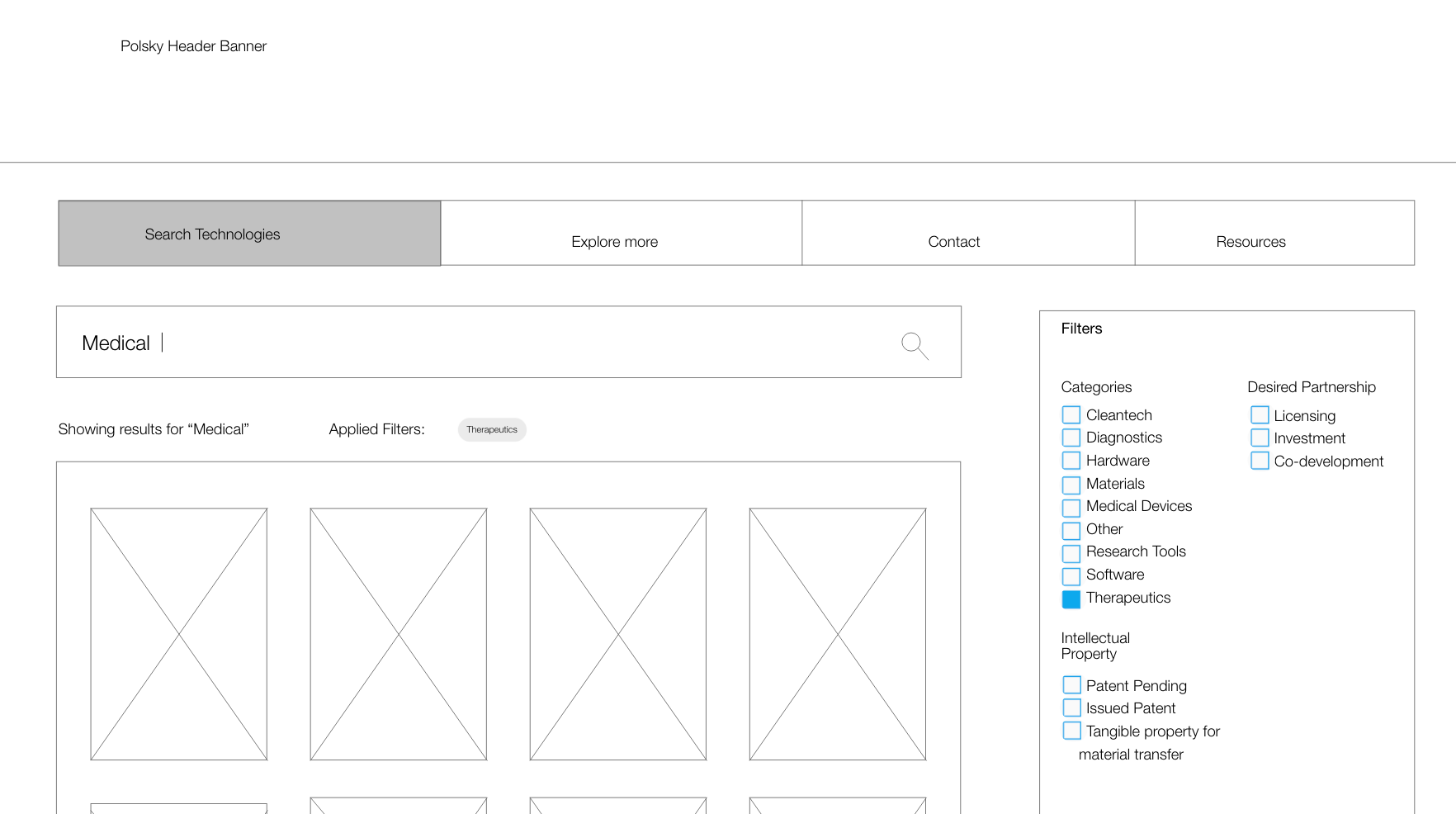
For the hi-fi designs, we used colors in alignment with the Polsky Center's style guide. Search results are available in both grid and list view, as users expressed preference for both options.
Users pointed out "Intellectual Property" and "Development Stage" as much more valuable information versus the original website's tech summary that cuts off, so we highlighted this information within the search results cards. We also provided more filters so that users may parse through more specific results that meet their needs.
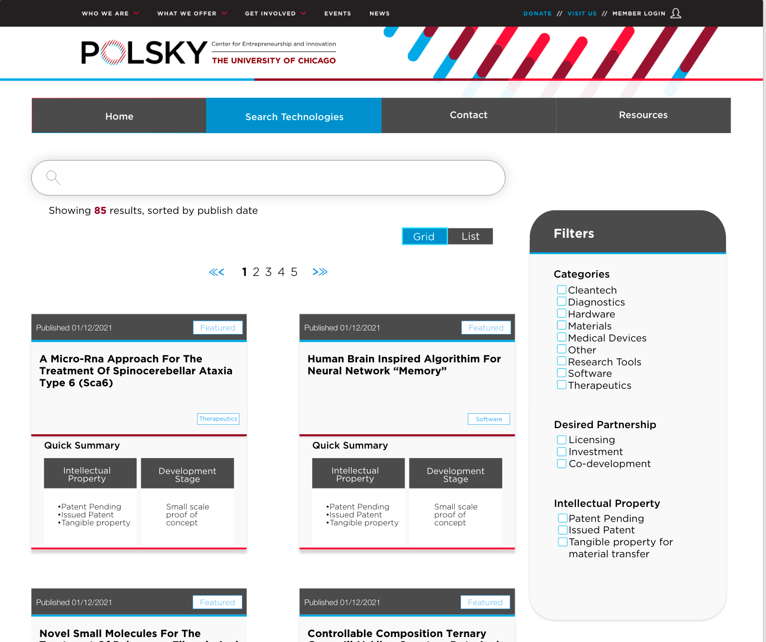
Final Redesigned Search Page
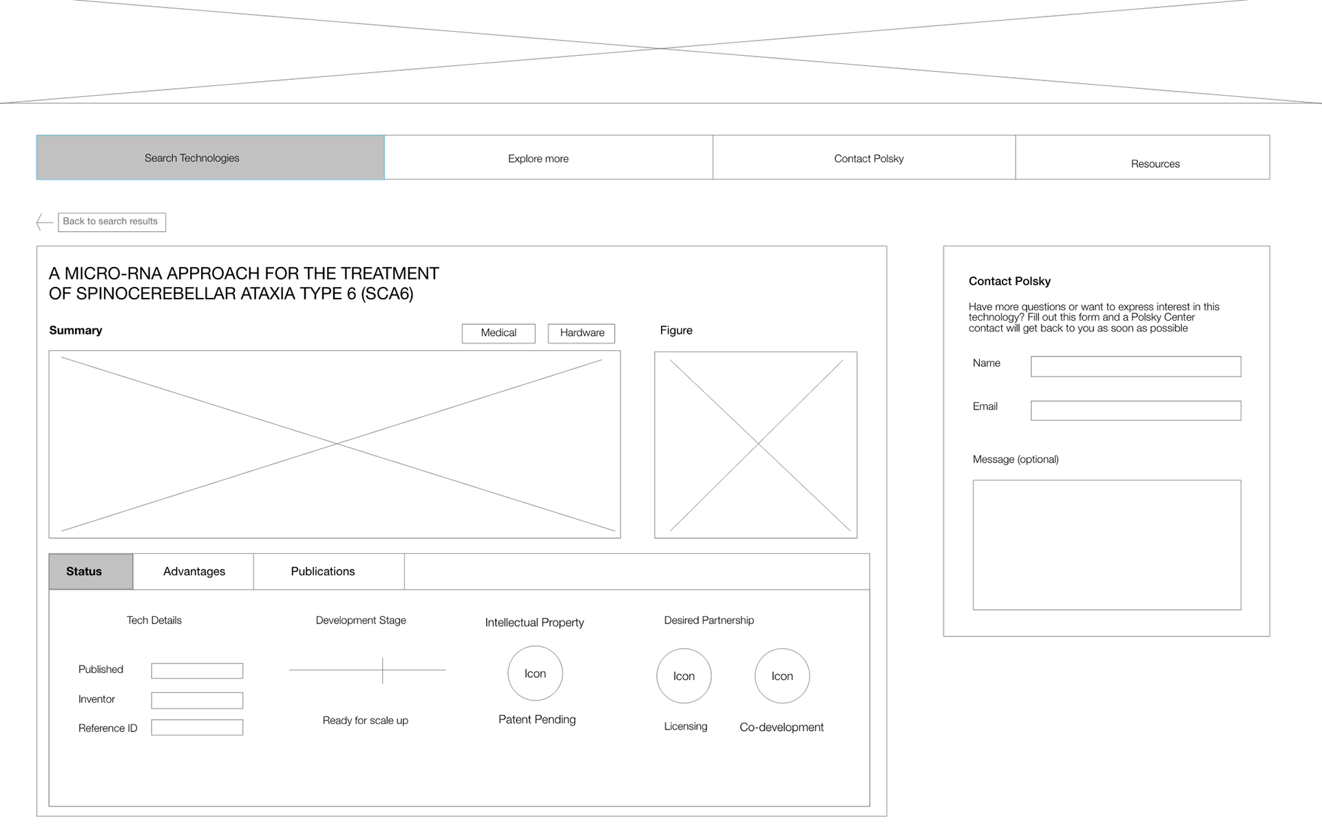
In order for users to quickly parse the tech information, we provide the info split between tabs (Summary, Status, Advantages, Publications). Contact is also conveniently located as a side card so that users may easily inquire about the specific technology.
I worked with my team to make prototype connections between the high-fidelity page designs. An interactive prototype link is provided at the end of this case study.
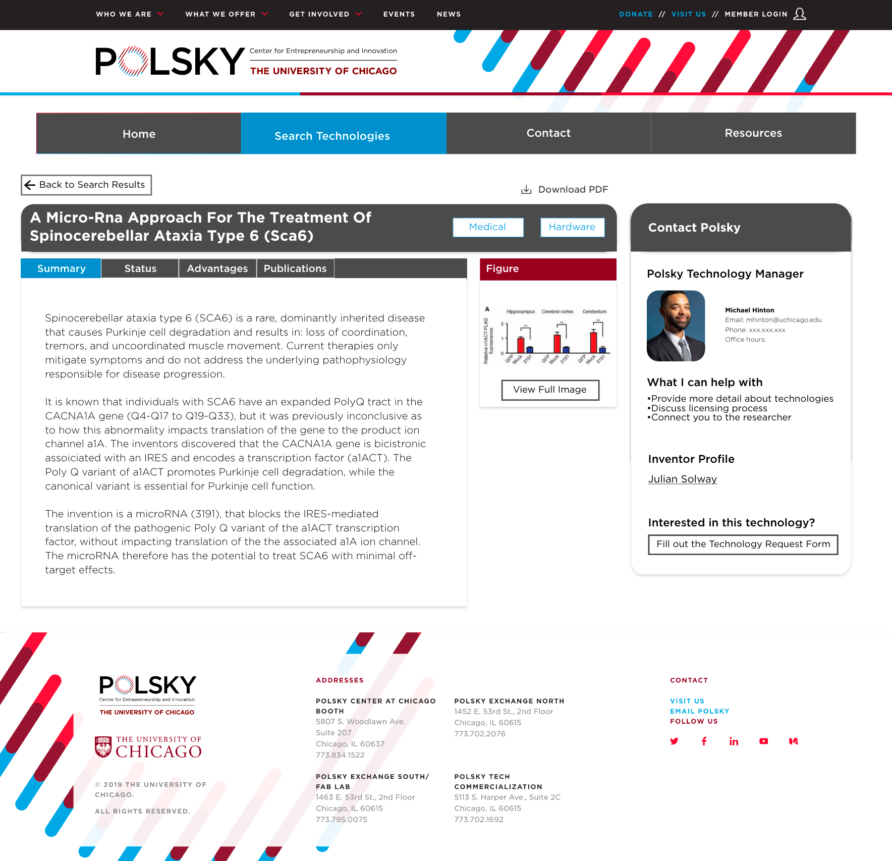
Final Redesigned Tech Detail Page
I designed the Resources page to be consistent with the Polsky Center's main page, with red titles and blue boxes. To minimize scrolling and provide immediate info, I decided to use a drop-down for Licensing/Additional Information. This resources page's drop down is also consistent with the style of the University of Michigan's technology publisher website.
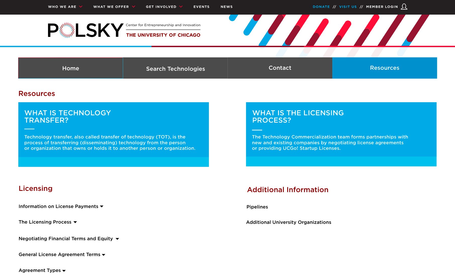
Final Resources Page
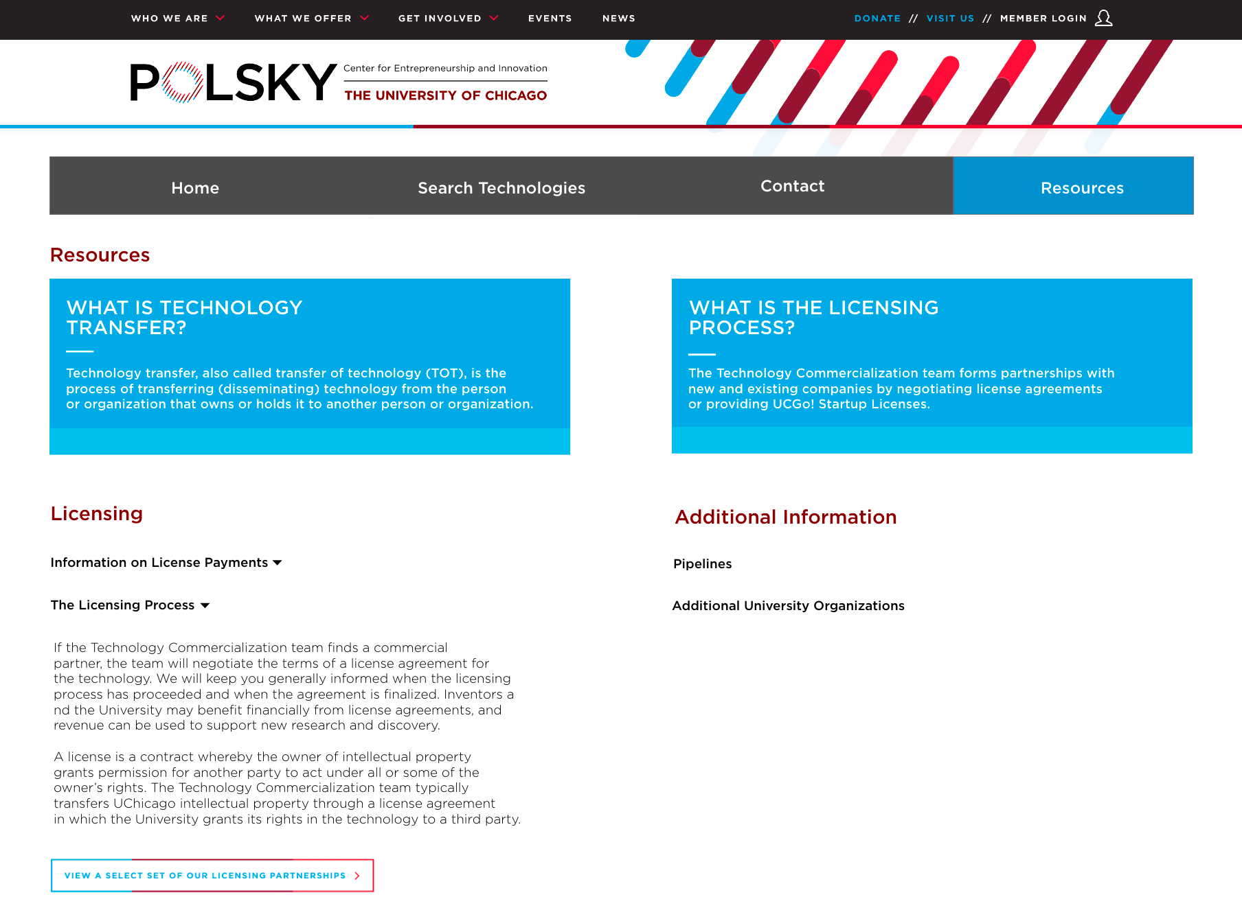
Resources Page: Information Drop-down
SITE MAP
The redesigned Polsky website has 4 main navigation webpages. The first is the Home page, which acts as the landing page for users. On this page, users are introduced to the Polsky Center and are invited to explore Polsky’s technology portfolio and success stories by category. The next page is the Search Technologies page, which is the core tool and functionality for users to discover technologies. Users can search and filter Polsky's technology portfolio on this page.
From the search results, users can select a technology to open up the Technology Detail Page. This webpage provides a user with all the information they need about a technology, including summary and technology status. From the Technology Detail Page, users can click a button that takes them to the Technology Interest Form to fill out their interest in a technology.
The next main webpage is the contact page, which allows users to quickly contact the Technology Manager at the Polsky Center and discover engagement opportunities with the center. The final main webpage is the Resource page. This page provides users with information that could help orient themselves to technology transfer and specific process at the Polsky Center.
Usability testing - design validation
Usability testing was conducted over Zoom using the same 4 participants as our previous round of testing under similar conditions. The same participants were used in order to gain a better understanding of potential improvements with our designs, compared to the original designs. The testing followed a similar procedure as previous tests, with users having to complete tasks and explore the pages of our high-fidelity prototype.
Similar to our previous tests, data was collected using a survey measuring our prototype on our existing system usability scale (SUS). Our focus throughout testing was to understand different user journeys through the Polsky site, resulting in our primary method of data collection being user testing and interviews. Using an existing usability scale allowed us to maintain consistency in our data collection method, enabling us to compare user data across our different web page designs.
main takeaways
• Users appreciated dual grid/list view, but wanted content grouping to be made more clear on grid view
• Users found the Explore More page to be very valuable, with better use serving as the Home Page
• Users found the newsletter placement confusing on the contact page
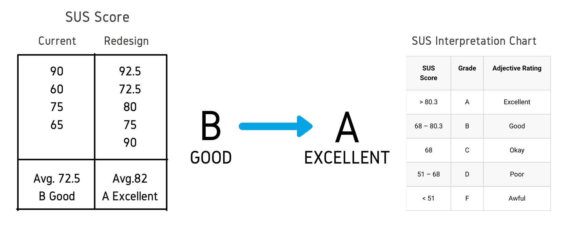
The redesigns saw an increased SUS score bumping the website from a rank B (Good) to A (Excellent), providing evidence that the new website is preferred by the target users for being easier to navigate and for improved discoverability of key elements.
FINAL RECOMMENDATIONS
Our website redesigns went through several iterative changes in order to meet the requirements of both our users as well as our stakeholders. Our final designs have incorporated feedback from each of our user tests and clients meetings. While our webpage redesigns are in the final handoff stages, there are still some final recommendations for each of the webpages.
The Home Page was generally well received in its redesigns, however, when development on this page begins, it should include more relevant and engaging content about how the Polsky center stands out in each category. Currently, elements of this page are substituted with filler content. Additionally, implementing more content and images for the success stories would create a more captivating experience for users.
The Search Page redesign was also well received by our usability testing participants. Initial design recommendations included replacing, ‘Desired Partnership’ with ‘Intellectual Property’ under the ‘Quick Summary’ portion of each technology. It was generally found that ‘Intellectual Property’ provided more useful and relevant information to the user experience.
While the grid format design was liked by most participants, some found it a bit confusing to understand how the information was being separated. We added drop shadows to each technology card and increased the horizontal space between them. It is recommended that the vertical space between each card is increased if there remains any confusion in the way the information is being presented.
The Technology Detail Page was many of our users' favorite redesign, however, there are still some final recommendations for this page. The technology interest form will take users to a form separate from the technology publisher website. It is recommended that this form automatically fill in the reference ID for the technology when a user clicks the button from the tech detail page in order to streamline the interaction.
The current development timeline image found on the status table serves as a blueprint for how the information should be displayed. It's recommended that this timeline image is depicted with the appropriate detail that accurately depicts the necessary and relevant information to users.
When implementing this, we would want to have consistent stages of development highlighted on the timeline to provide additional context to the development status of a technology. When a user selects “Back to search results,” final recommendations suggest for the page to maintain the location and search parameters in which the user clicked into the technology detail page. Users expressed the importance of maintaining their previous search criteria when going back to the overall search results page, so we believe this would be a worthwhile implementation.
We received mixed responses and feedback from our usability test sessions about the newsletter, and determined that the ‘Partner With Us’ content is more relevant to users and contains more valuable information. The buttons in this section link to external Polsky webpages and the associated content may need to be updated if these pages are altered during the main website redesign. If further interactions suggest that users don’t seem to be interacting with the newsletter, we recommend replacing it with another link to the Technology Request Form that is included on our Technology Detail Page.
The Resources Page redesign was positively received overall, with the dropdown feature proving to be helpful to most users. Many of the buttons present in the dropdown link to external Polsky webpages. In the event that these pages change during Polsky's main website redesign, the associated content may need to be updated. Additionally, recommendations received from our usability test sessions included potentially renaming the title of the page as some of our users found that “Resources” didn't necessarily appropriately represent the information being delivered.